
Data visualization allows you to present your data in a graphical or pictorial format. Visualizations are intended to capture your visitors attention and help them comprehend information quickly.
Usage, Best Practice, and Accessibility
Examples
Area chart
Bar chart
Column chart
Donut chart
Line chart
Pie chart
Spline chart
There are two ways to add data visualization to your site. For plotting existing internal or external data, please use the “Views” option. For plotting data at the time of entry, please use the “Blocks” option. To set up data visualization, follow the steps below.
1. Views Option:
- Enable the Folwell Data Visualization module by going to the Extend page. This will enable the Charts, Highcharts and Charts Block modules.

- Create a new content type that has fields to hold numeric data for the graphs. You could also add numeric fields to the existing content type.
- In your content type, make sure to have at least one field that holds numeric data for your data visualization.
- Create a View (Admin >> Structure >> Views).
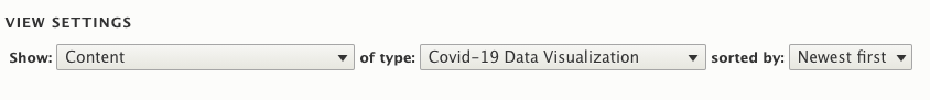
- Under the “View settings” section, choose the content type that holds the graph data.
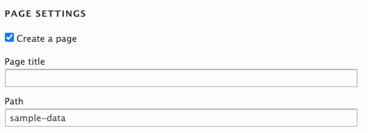
- Under the “Page settings” section, fill out the “Page title” and “Path”.
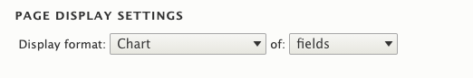
- Under the “Page display settings” set display format to “Chart” of “fields”.
- Check the “Create a block” checkbox if you wish to create a block for this view.
- Click the “Save and Edit” button.
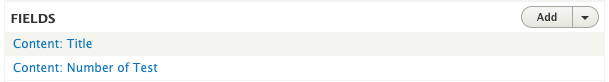
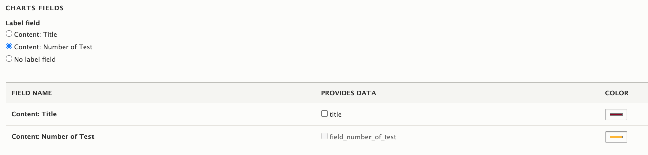
- On the next screen, navigate to the “Fields” section and add at least one numeric field from the content type created on the step 2 above.
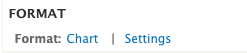
- Under the “Format” section, click the “Settings” link next to the “Chart” link.
- On the next screen, do the following configuration
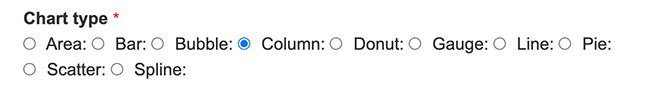
- Choose the chart type you want under the “Chart type” section.
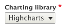
- Under the “Charting library” dropdown, select “Highcharts”.
- Under the “Charts fields” section, choose at least one numeric field.
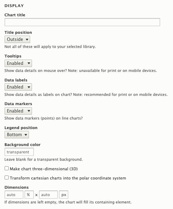
- Add the “Chart title” under the “Display” section.
- Optionally, you could adjust the following settings as per your needs.
- Title position
- Tooltips
- Data labels
- Data markers
- Legend positions
- Background color
- Make chart three-dimensional (3D)
- Transform cartesian charts into the polar coordinate system
- Horizontal axis
- Vertical axis
- Click "Apply" button
- Your chart will be displayed in the preview.
- Choose the chart type you want under the “Chart type” section.
2. Block Option
You can add data visualization in layout builder using an inline block.
- Go to your node and click the “Layout” button.
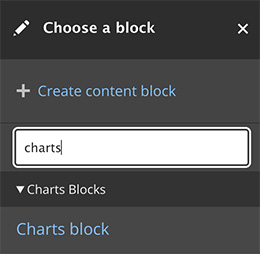
- Click the “Add block” link on the layout section where you want to place the data visuzaulation.
Under “Choose a block”, locate the Charts blocks section and click “Charts block”.
- On the next screen under the charts configurations section, do the following configuration:
Under the “Charting library” dropdown, select “Highcharts”.

Choose the chart type under the “Chart type” section.
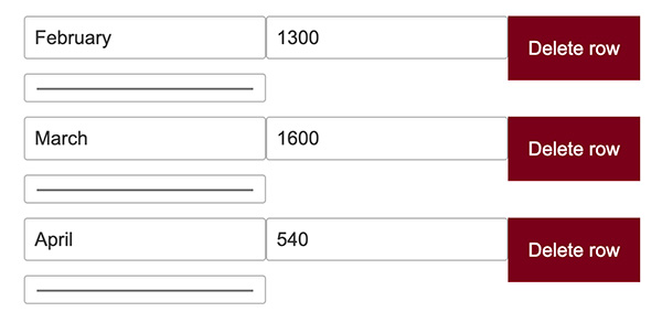
Under the "Categories are identified by" section, identify whether the categories data is located in the first row or column. Select the appropriate option accordingly.

Add the data to the table cells provided. You can add and delete columns and rows using the buttons provided on this section.
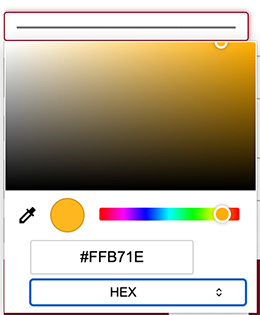
- Click on the color picker under each row to choose color for your chart. Here are lists of colors we recommend.
- Light maroon #900021
- Dark gold #ffb71e
- Blue #00759a
- Light gray #d5d6d2
- Dark maroon #5b0013
- Green #58a618
- Dark gray #5a5a5a
- Orange #e37222
- Light gold #ffde7a
Darker gray #333333
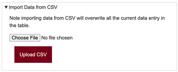
Optional: You have the option to import data from a CSV file instead of manually adding it. Please note that importing data from a CSV file will overwrite all current data entries in the table.
- Add the “Chart title” under the “Display” section.
- Optionally, you could adjust the following settings as per your needs.
- Title position
- Tooltips
- Data labels
- Data markers
- Legend positions
- Background color
- Make chart three-dimensional (3D)
- Transform cartesian charts into the polar coordinate system
- Horizontal axis
- Vertical axis
- Click “Add block” button
- Your data visualization will be displayed on your layout section.
- Choose the right visualization for your data:
- Area chart functions the same way as a line chart only it fills the area between the line and the threshold, which is 0 by default.
- Bar chart is exactly the same as a column chart; only the x-axis and y-axis are switched.
- Bubble chart provides a visual representation of multiple data points, facilitating the visual evaluation of their relationships. This type of chart is effective for analyzing information from various sources, enabling viewers to identify patterns within the data.
- Column charts display data as vertical bars. A feature of column charts allows for different data to be compared alongside one another. It is similar to bar charts, the difference being that bar charts have a horizontal representation of the data.
- Donut chart is functionally identical to a pie chart, with the exception of a blank center and the ability to support multiple statistics at once. It provides a better data intensity ratio to standard pie charts since the blank center can be used to display additional, related data.
- Line chart is represented by a series of data points connected with a straight line. Line charts are most often used to visualize data that changes over time.
- Pie chart divides your data into distinct sections that represent a proportion of the whole.
- Scatter chart draws a single point for each point of data in a series without connecting them.
- Spline chart draws a curved line between the points in a data series.
- Avoid creating data visualizations that require interaction in order to get your message across
- Label data points instead of referring to a legend
- In 3D charts, the volume of an object increases at a faster rate than its area. It's recommended to minimize the use of 3D charts when the default 2D charts covey the needed information.
- All data visualizations include proper ARIA labels by default.
- It is keyboard navigable.
- It provides the option to display data visualization as data table.
- Directly label visualizations for quick comprehension.
- Ensure the text and color passes the accessibility color contrast test.
- Avoid relying on color as your only visual cue.
- Give context to each data visualization with a brief summary of your data results.
Note: Currently, the NVDA screen reader is not accurately reading values and instead reads them as "Blank." A ticket has been submitted to the Highcharts library, and we will update the Folwell site as soon as the issue has been resolved.